Now today, Barnes and Noble lowered the price of the Nook to $149 and Amazon reduced the Kindle to $189. That should boost sales for both products, which is great news for those of us who provide content for those devices.
My book, Pilikia Is My Business, has been available in the Kindle store for about a year and sales have been pretty weak. Most of that is my fault. I haven't done much to promote the book. I have decided, however, that now is the time to catch the ebook wave. That means a new edition of Pilikia for the iBook, Nook and Kindle stores. A new edition requires a new cover, so I contacted a graphic artist about designing a new one for me.
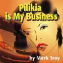
What do I like about the cover?
1. It contains elements that actually appear in the story.
2. A character figures prominently.
I like covers that show something about a character. I'm not a fan of covers that show inanimate objects. Robert Parker's Hundred Dollar Baby has a picture of a semi-automatic pistol and a red garter belt. I get that it's a mystery with a woman, but I would rather see the character holding the gun and a woman wearing the garter. In short, I like to see not only a character, but something of the character's plight on the cover. The kind of covers found on vintage paperbacks by artists such as Robert McGinnis and Robert McGuire met this ideal
What I don't like about my Pilikia cover is that there is no story. Val's plight is not evident anywhere on the cover. In fact, you can't even tell it is a mystery.
So, my first two requirements for a cover are 1) character, and 2) story.
Another feature of vintage paperbacks is that they stood out on the drugstore racks where they tended to be sold. There was nothing subtle about them. They were designed to catch the attention of shoppers across the store. Subtle covers are fine for books sold in bookstores where customers browse leisurely and up close through the offerings. When you have only a small item that must stand out, color and a striking image become important.
Have you seen how books are sold in the iBook, Kindle and Nook stores? They are displayed by thumbnails, with eight, ten or twenty thumbnails per page. The iBook thumbnails are smallest, measuring three eighths of an inch wide and five eighths high. The Kindle thumbs are twice that size and the Nook thumbs are slightly larger. They are being sold like drugstore books. They are arranged on the page, the way paperbacks were displayed on racks in the old days. Most of the bookcovers currently in the online stores are full-size covers shrunk down to tiny size. Most of them fail to grab your attention. To get attention in an online store, I believe, a cover must show a character in some kind of danger. The image must be clearly visible and striking, not subtle, with vibrant colors.
So now I have three requirements for a cover:
1. character
2. story
3. striking enough to grab attention when shrunk to 3/8" by 5/8" size.
In my next post, I'll show my top choices for the new edition of Pilikia Is My Business. What do you like in a book cover?
Mark Troy
http:// Hawaiian-eye.blogspot.com
4 comments:
I find coming up with titles to be daunting enough. Filling out a 'cover sheet request form' is tough enough. I'm one of those who can look at a cover after someone else designs it and say, "this isn't quite right" but having to come up with an image is scary. Right now, I'm in the process of uploading two short stories to Smashwords, and the covers are the hangup.
I think it also has to be fairly simple with at least one bright color. Some thumbnails are so crowded, I can't tell what's going on.
I know what you mean, Terry. I took a stab at designing my own covers and they were awful.
I agree, Helen. There is set of Janet Evanovich covers here (http://www.fantasticfiction.co.uk/e/janet-evanovich/) in which the the thumbnails for One, Two, Four, Five and Six are clear and uncomplicated, but Three is so crowded you can't make it out. Beginning with Seven, she was such a star, all she needed was her name on the cover.
I've gotten lucky. My husband is an amateur photographer and I get to use some of his pictures for my covers. I've done a little photoshopping on some of them (just for my needs and for the book). Let me know what you think about them if you want.
Post a Comment