Showing posts with label Book covers. Show all posts

Sunday, April 13, 2014

Changing The Covers on My Books by Mar Preston


I liked the previous covers of my four books. But a smooth-talking Irishman, who presented as a social media expert at a conference I recently attended, persuaded me the covers looked amateur. I fell under his spell and found myself agreeing I needed to update them.

What do I know about covers? I read advice from the same marketing whizzes that you do probably. I know that it’s not an original idea to change a cover on a book that’s not selling well and promoting it as a new title.

I can’t claim that my earlier books are selling well. Don’t know about you.

So the Irishman connected me to a New York City cover designer and I browsed through his website. My previous cover designer is a hard-working, competent web developer and designer who has put up with me for years now and I feel a loyalty to him. However, the covers that I saw by the NYC designer dazzled me. His terms were affordable and I decided to give it a try with new covers.

On Behalf of the Family is a police procedural about an honor killing that takes place in glitzy Santa Monica. It’s long on characterization, short on car chases and explosions. My series detective is with the Santa Monica Police Department.

I am asking your opinion. Do you like the cover change?

So far the Buy Button hasn’t been clicking in huge numbers but I wouldn’t be a writer, would I,  if I weren’t hopelessly optimistic. 

What do you think?


Original Cover

                The Buy Button

             
                http://www.amazon.com/ebook/dp/B00I82BFVK 


 The New Cover 


Wednesday, July 3, 2013

Sometimes Publishers Get It RIght

Lately it seems to be the fashion to bash traditional publishers; I’ve done it myself – and let’s face it, sometimes the criticism is right on because some of the things they do are just wrong, wrong, wrong. Sometimes, though, they aren’t. (Though I admit I still don’t get why some publishers demand that authors follow their detailed and occasionally arbitrary formatting – which doesn’t necessarily match that of any other publisher, necessitating a complete almost character by character work-through if the book is ever to be sent elsewhere – just to be able to submit a manuscript. That is not the focus of this blog, though.)
I do believe, though, that if we are free to gripe about the follies of some publishers, we have the equal duty to be unstinting with praise when a publisher gets it right!
Several years ago, when I wrote only as Janis Susan May and Janis Patterson had not yet been thought of, two of my best romantic mysteries were brought out in trade paper by Vinspire Publishing, once called Vintage Romance Publishing. (Now they’re e, too!) The covers were cute – well, sort of. They were okay, but I wasn’t wild about either one of them. Sales were somewhat respectable but, as time went on and on, I kept expecting Vinspire to pull the books from the catalogue.
Then - ! A couple of months ago I got an email from my wonderful editor Dawn Carrington, who said quite frankly she though the original cover of ECHOES IN THE DARK didn’t do the book justice, that she thought the book was so good it should be selling more, so she had commissioned a new cover. When I opened the new cover I almost cried. It was so beautiful! Here - take a look; wouldn’t you have?
ECHOES IN THE DARK - new cover (remember, it is a romantic mystery, not a straight mystery…)

Well, I just felt wonderful. The good luck pixies had gifted me and I was gratified to see sales rising again.
Then, some time later, the unexpected happened. Again. My editor emailed, saying she was so happy that sales on ECHOES were climbing, she had decided to get a new cover for DARK MUSIC as well. Now DARK MUSIC is also sort of a romantic mystery, but one that is more mystery with just a touch of romance, if that makes any sense.
Here’s the new DARK MUSIC cover –


Don’t know if the cutline will come through on the blog page (remember I am a total techno-naif) but it says “They might have a future unless the next scream is hers.”
My editor says the new cover is already stirring interest.
I think it’s wonderful and hope it starts a huge groundswell in the industry. Just imagine - a traditional publisher working with the author, doing what is necessary to sell the books, taking a personal interest in their writers’ success…
See? Sometimes publishers do get it right. Yea for them!


Janis Patterson

Wednesday, June 23, 2010

ebook covers

There is a shakeup going on in the world of ebooks. The success of the iPad has created a price war among makers of ebook readers. Sales of ebooks have jumped tremendously. Apple says that iPad owners have bought more than 5 million ebooks in the two months the iPad has been on the market. The iBook reader is available for the new iPhone which was released to unprecedented demand. You can bet a lot of people will be reading books on the iPhone.

Now today, Barnes and Noble lowered the price of the Nook to $149 and Amazon reduced the Kindle to $189. That should boost sales for both products, which is great news for those of us who provide content for those devices.

My book, Pilikia Is My Business, has been available in the Kindle store for about a year and sales have been pretty weak. Most of that is my fault. I haven't done much to promote the book. I have decided, however, that now is the time to catch the ebook wave. That means a new edition of Pilikia for the iBook, Nook and Kindle stores. A new edition requires a new cover, so I contacted a graphic artist about designing a new one for me.

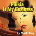
But first, I did some thinking about covers. Here's the cover of Piikia as it appeared on the first LTDBooks edition. The two elements are the face of a woman, presumably Val Lyon, the main character, and a late model sedan. Such a car does play a role in the story.

What do I like about the cover?
1. It contains elements that actually appear in the story.
2. A character figures prominently.

I like covers that show something about a character. I'm not a fan of covers that show inanimate objects. Robert Parker's Hundred Dollar Baby has a picture of a semi-automatic pistol and a red garter belt. I get that it's a mystery with a woman, but I would rather see the character holding the gun and a woman wearing the garter. In short, I like to see not only a character, but something of the character's plight on the cover.  The kind of covers found on vintage paperbacks by artists such as Robert McGinnis and Robert McGuire met this ideal

What I don't like about my Pilikia cover is that there is no story. Val's plight is not evident anywhere on the cover. In fact, you can't even tell it is a mystery.

So, my first two requirements for a cover are 1) character, and 2) story.

Another feature of vintage paperbacks is that they stood out on the drugstore racks where they tended to be sold. There was nothing subtle about them. They were designed to catch the attention of shoppers across the store. Subtle covers are fine for books sold in bookstores where customers browse leisurely and up close through the offerings. When you have only a small item that must stand out, color and a striking image become important.

Have you seen how books are sold in the iBook, Kindle and Nook stores?  They are displayed by thumbnails, with eight, ten or twenty thumbnails per page. The iBook thumbnails are smallest, measuring three eighths of an inch wide and five eighths high. The Kindle thumbs are twice that size and the Nook thumbs are slightly larger. They are being sold like drugstore books. They are arranged on the page, the way paperbacks were displayed on racks in the old days. Most of the bookcovers currently in the online stores are full-size covers shrunk down to tiny size. Most of them fail to grab your attention. To get attention in an online store, I believe, a cover must show a character in some kind of danger. The image must be clearly visible and striking, not subtle, with vibrant colors.

So now I have three requirements for a cover:
1. character
2. story
3. striking enough to grab attention when shrunk to 3/8" by 5/8" size.

In my next post, I'll show my top choices for the new edition of Pilikia Is My Business.  What do you like in a book cover?


Mark Troy
http:// Hawaiian-eye.blogspot.com

Saturday, February 21, 2009

Judging a Book by its Cover

By Jean Henry Mead

Can a great looking book cover sell a poorly written book? The answer is yes if the buyer is in a hurry and doesn’t take time to read. Conversely, does a poorly designed cover discourage sales of a good book? It can if word of mouth hasn’t proclaimed the book a good read or it wasn’t written by a favorite or bestselling author.

A book cover should represent its contents, mood and style. The artwork should not only be attractive but represent the book’s meaning as well as attract potential buyers. It should also project drama and literary punch. That’s a tall order, which doesn’t always happen. Books that are projected to sell less than 5,000 copies are deemed unworthy of original artwork and are consigned to the cheap stock illustrations.

In large publishing houses, the author, who usually wants complete approval of the book cover, rarely has the leverage to get it. Most writers have to settle for some kind of guaranteed consultation, which means that they get to see a semi-final proof. Working with a small press has its advantages if the publisher allows an author the right to reject a cover he or she don’t like, but that doesn’t always happen. Sometimes none of the artwork pleases you so you choose the one that’s least objectionable.

Because I don’t want to make negative remarks about anyone else’s books, I’ll use my own as examples. My historical Wyoming novel, Escape, has an attractive cover and remained number one in sales for two months in multi format while my recent mystery/suspense novel, A Village Shattered, topped the list for only half that time. I blame it on the lackluster cover, which is gray to represent the fog that hides the serial killer. It looks okay when held, but comes across as dreary and boring online.

The second book in the series, Diary of Murder, has a snowy mountain background instead of a diary, which has little to do with the title although mountains do play a role later in the plot. Fortunately, I was able to submit a photo I had taken of the actual area instead of the one the publisher was planning to use, but I’m still not completely happy with the results.

Another problem that comes into play is the size of the author’s name. The name should increase in size with each book published, but if you have three names like mine, it can only grow large enough to fit across the page. That’s not author ego, it tells the potential buyer your status in the publishing industry.

Color has a lot to do with the cover’s appeal. Reds, bright blues, greens and yellows catch the eye and shout, “Pick me up and read me.” While grays, tans, white and beige backgrounds don’t appear to be as interesting unless, of course, the foreground is colorful and attractively designed. Rich colors such as burgundy with gold lettering denote a richness of plot as well.

Which book covers appeal most to you and did you pick them up because of their designs?