Can a great looking book cover sell a poorly written book? The answer is yes if the buyer is in a hurry and doesn’t take time to read. Conversely, does a poorly designed cover discourage sales of a good book? It can if word of mouth hasn’t proclaimed the book a good read or it wasn’t written by a favorite or bestselling author.
 A book cover should represent its contents, mood and style. The artwork should not only be attractive but represent the book’s meaning as well as attract potential buyers. It should also project drama and literary punch. That’s a tall order, which doesn’t always happen. Books that are projected to sell less than 5,000 copies are deemed unworthy of original artwork and are consigned to the cheap stock illustrations.
In large publishing houses, the author, who usually wants complete approval of the book cover, rarely has the leverage to get it. Most writers have to settle for some kind of guaranteed consultation, which means that they get to see a semi-final proof. Working with a small press has its advantages if the publisher allows an author the right to reject a cover he or she don’t like, but that doesn’t always happen. Sometimes none of the artwork pleases you so you choose the one that’s least objectionable.
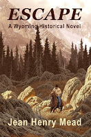
 Because I don’t want to make negative remarks about anyone else’s books, I’ll use my own as examples. My historical Wyoming novel, Escape, has an attractive cover and remained number one in sales for two months in multi format while my recent mystery/suspense novel, A Village Shattered, topped the list for only half that time. I blame it on the lackluster cover, which is gray to represent the fog that hides the serial killer. It looks okay when held, but comes across as dreary and boring online.
The second book in the series, Diary of Murder, has a snowy mountain background instead of a diary, which has little to do with the title although mountains do play a role later in the plot. Fortunately, I was able to submit a photo I had taken of the actual area instead of the one the publisher was planning to use, but I’m still not completely happy with the results.
 Another problem that comes into play is the size of the author’s name. The name should increase in size with each book published, but if you have three names like mine, it can only grow large enough to fit across the page. That’s not author ego, it tells the potential buyer your status in the publishing industry.
Color has a lot to do with the cover’s appeal. Reds, bright blues, greens and yellows catch the eye and shout, “Pick me up and read me.” While grays, tans, white and beige backgrounds don’t appear to be as interesting unless, of course, the foreground is colorful and attractively designed. Rich colors such as burgundy with gold lettering denote a richness of plot as well.
Which book covers appeal most to you and did you pick them up because of their designs?
9 comments:
The Jennifer Rardin covers and the Kim Harrison british covers (weird stylised ones) caught my eye. Yeah they were why i picked up the book and read the blurb.
I definitely go by covers first. After that, back of book, then first page. I've wavered over buying books that have great covers, even though I'm hesitant about the writing. I usually come to my senses and put the book down, but reluctantly.
Morgan Mandel
http://morganmandel.blogspot.com
http://twitter.com/morganmandel
I love this topic, especially since I am a former cover artist and art director. In a recent RWA chapter meeting, the subject of small press vs. NY pubs led to mention of an author's say in cover art selection.
From the artist's or publisher's viewpoint, I have to say that quite often, the author's idea of what should be on the cover is not always the best concept for selling the book. Some authors ask for several story elements to be depicted, making the cover inordinately complicated; the reader's eyes just don't know where to look first.
Simple is good. As you say, color and tone set a "mood" for the cover. Whether or not people are shown is another important element. Many cover artists are now using "Poser" or computer-generated figures in lieu of real photos of people. This method may or may not appeal to the author. What looks good on a sci fi book may look awful on a romance.
I'm most often influenced by covers that stand out as different. The "clinch" covers have seen their day (Romance.) The woman running away from a castle is passe (Gothic.) More recently, some big name authors have gone with more generic, flower-laden artwork that has nothing to do with the story between the covers. Mysteries are sometimes seen with a single element, i.e., a knife, a gun, an object of art, etc.
Worst, of course, is artwork that is just plain wrong. The heroine is a blonde, but on the cover she is a redhead. Story takes place on a lake, but the book shows a Cape Cod shoreline. How does that happen?
~Anne
http://beacon-street.blogspot.com
Oops! My post got so long I forgot to mention what I really wanted to say! My cover for POINT SURRENDER depicts the lighthouse from the story. Although the lighthouse is fictional and located in No. California, Heceta Head in Southern Oregon actually inspired the setting. My publisher, Echelon Press, obtained the rights to use the photo of Heceta Head on my cover. I was, of course, delighted. It really sets the mood for the story of the abandoned lighthouse not visible from the highway.
~Anne
http://www.beaconstreetbooks.com
Striking covers usually attract me. Black and red seems to be popular covers lately in mystery and YA paranormal/suspence (or whatever the books about vampires, werewolves, etc. are called).
I won't always get the book with the striking cover, but it will often get me to pick it up.
If it's in a bookstore, though, the one thing that draws my eye is being turned face out. Which is why when I'm in a bookstore, I look to see if the store carries books by my friends. If so, I turn at least one face out.
Your covers are beautiful.
At the PSWA conference last year we had a speaker talk about covers and what attracts people to them.
Yellow was said to be the favored color.
Marilyn
http://fictionforyou.com
Now that so much marketing is done on the internet, covers need to be eye-catching and legible in thumbnail size.
I didn't like the cover of my book the first time it was published. When it came out from my second publisher, tho, I thought it was terrific and still do. The main feature is a pair of woman's eyes at the top. When I asked the Managing Editor who designed it, she hesitated, then said, "I did." She hesitated again,then said, "The eyes are mine." I think that's so cool. Curiously, one of the eyes is blue, the other one brown. Could that be a clue? HehHehHeh. I ain't talking.
A cover (like a good wine label) definitely attracts my attention. Then I read the blurb...and then I look at the first few pages. Great covers don't always add up to a good book, but they'll get me to take that first look!
Post a Comment